Linking outcomes and impacts to outputs/services
Our general observations
Annual reports generally have separate sections that report on their annual service delivery and progress against their strategic intentions, including their impacts and outcomes. Annual reports that explicitly link these aspects of reporting in some way gave users better insight into the relationship between these different aspects of performance.
Waka Kotahi NZ Transport Agency
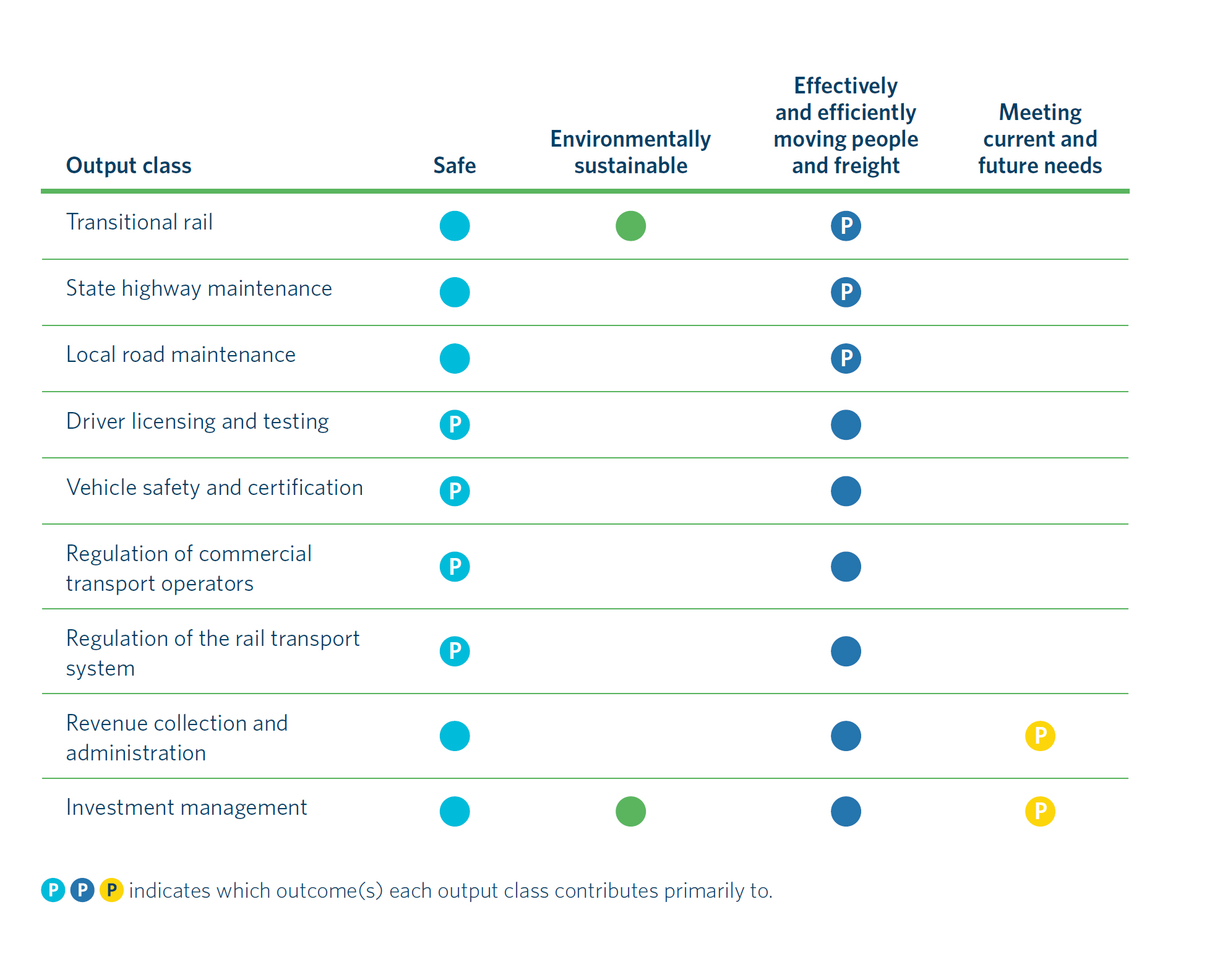
Waka Kotahi NZ Transport Agency's 2020/21 Annual Report structures and brings together reporting based on outcomes and outputs. This helps to provide a meaningful and understandable account of how multiple key initiatives and services are making a difference to an issue or outcome that matters to users.
What we liked:
- Table showing the primary, and other, contributions of each output class to its systems outcomes where there are many-to-one relationships.
- Individual system outcomes are clearly connected to multiple key initiatives and outputs/services, with concise and comprehensive explanations and analysis.
- Reporting on outcomes is linked to more detailed service performance reporting later in the report.
- Colour coding is carried through to the detailed output class results sections, which makes it easy to follow.


New Zealand Customs Service
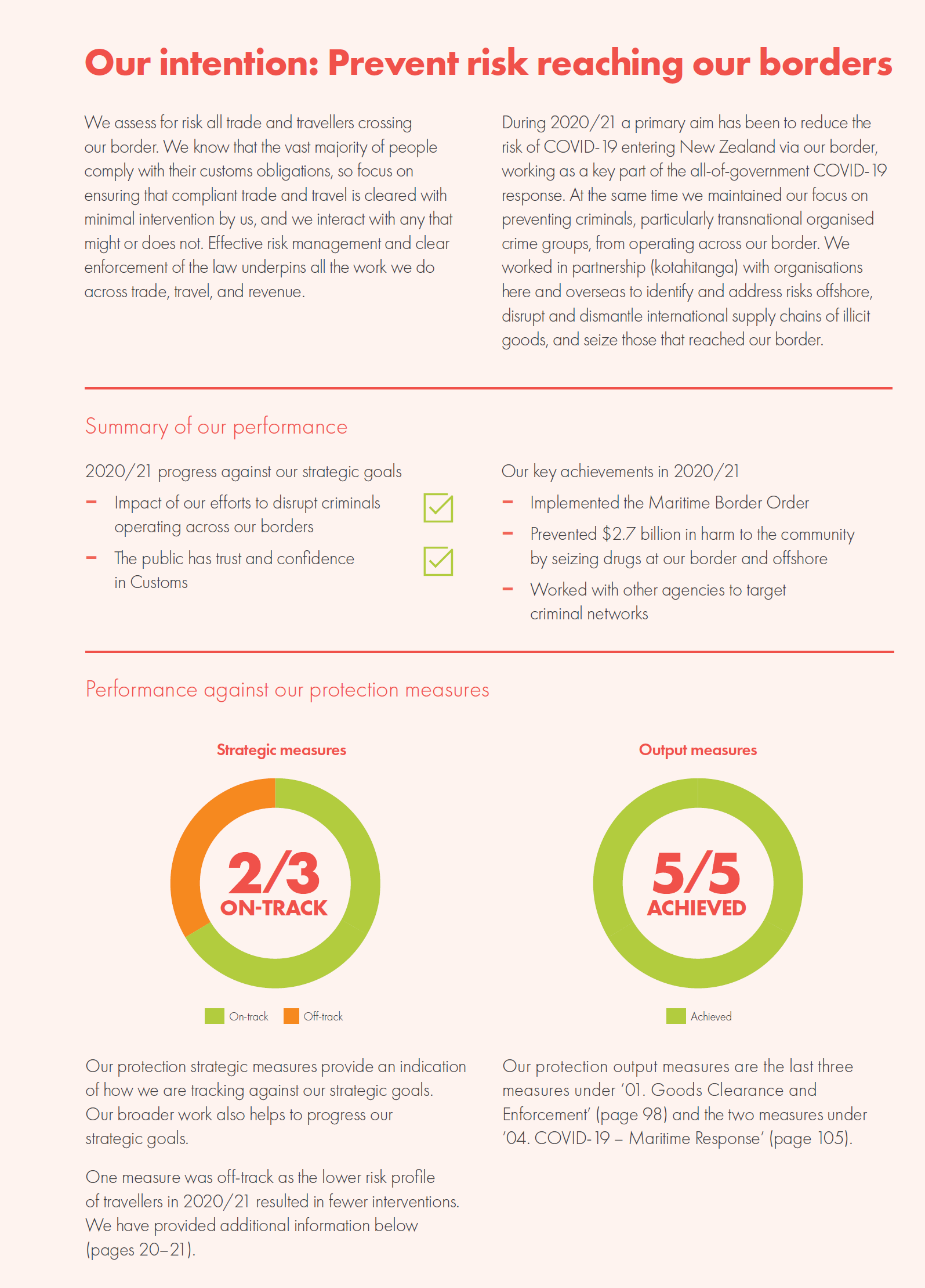
New Zealand Customs Service's 2020/21 Annual Report presents visually engaging layers of performance information that is easy to understand. It clearly connects its services and initiatives to what difference it wants to make. This enables users to clearly understand how well it is performing.
What we liked:
- Clear structured reporting under each intention/outcome area, with links to multiple key initiatives and outputs/services. Concise and comprehensive overviews, summaries, and analysis.
- Good mix of quantitative and qualitative performance measures and descriptions at the outcome and output levels.
- Visually engaging presentation of information.
- Reporting on outcomes is linked to more detailed service performance reporting later in the report.

Energy Efficiency and Conservation Authority
Energy Efficiency and Conservation Authority’s 2020/21 Annual Report uses a range of simple techniques to explicitly connect the different elements of their performance.
What we liked:
- User-friendly one-page summary of its overall outcome, five strategic focus areas, levers for influencing these, and the money spent on each outcome (see page 8 of the annual report).
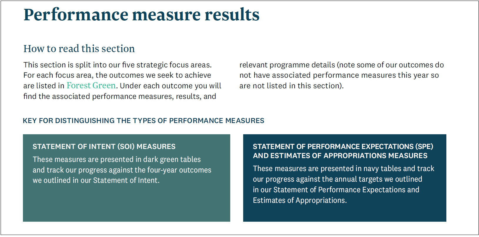
- Clear and simple instructions to help readers follow the document.
- Medium-term (outcome) and annual (output) measures are reported together by strategic focus area. Measures are distinguished by colour coding, which allows connections to be easily seen.
- Reporting recognises complex relationship between impacts and levers.
- Comprehensive and structured reporting under each focus area (e.g. businesses, households, and transport).
- Good mix of performance measures and descriptions at the outcome and output levels.


