Appendix 2: Graphing service level performance
The graph below shows one way contact centres can report their service level performance, by interval, for a month.
The data used to generate the graph is for illustrative purposes only, and does not show the performance of Work and Income’s contact centre.
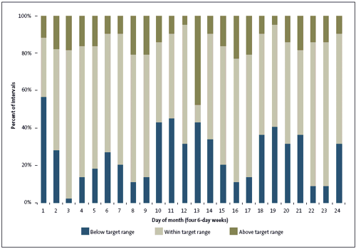
Example graph showing service level performance by interval for a hypothetical month (24 days)

The graph is a stacked bar graph. Each bar represents 100% of the 15-minute intervals for one day the example contact centre was open.
The bottom portion of each bar shows the percentage of intervals in which the example contact centre’s service level was below its target range. The middle portion of each bar shows the percentage of intervals in which the example contact centre’s service level was within its target range. The top portion of the bar shows the percentage of intervals in which the contact centre’s service level exceeded the target range. This graph does not show whether the daily service level was within the target range.
On day 1 of the month, the example contact centre’s service level was below the target range for nearly 60% of the 15-minute intervals in the day. The service level was in the target range for around 30% of the intervals in the day. Just over 10% of the intervals in the day had a service level that exceeded the target range.
On day 23 of the month, the service level for nearly all the intervals in the day was within the target range. Fewer than 10% of intervals had a service level below the target range and just over 10% of intervals had a service level above the target range.
Day 13 shows a day in which, although the daily service level may well have fallen within the target range, there were a significant number of intervals in which the service level was above or below the target range. When the service level is below target, callers wait longer to be answered. A service level above target suggests that there are more staff answering the telephones than is necessary to provide the target service level. This may be inefficient.
A graph such as this clearly shows whether the daily target is being met by keeping the service level relatively consistent throughout the day, or whether there are significant periods in which the service level is higher or lower than the target.
page top
